Finalist, World UX Championship.
Selected amongst top 10 students all over the world.
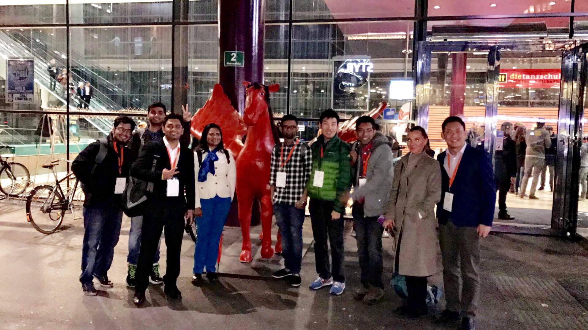
^ With all the 10 participants and Pegasus, the mascot of World Usability Congress (WUC). (I am the one on the extreme left)
About
World Usability Congress (WUC) is one of the premier conferences on Usability, User Experience (UX) and Customer Experience in the world. It’s regularly attended by top UX speakers from companies ranging from Google, HP, IKEA, Skype etc. In 2016, for the very first time they organized the World User Experience championship. Details:
- 150 different universities from all around the globe had been invited to be part of the championship, and had to send their top UX students to participate.
- All participating students had to solve the same task individually, visualize and prepare their solution as an A0 PDF.
- This, in turn, will then be sent to the UX World Championship Jury.
- The best 10 students will be invited to be part of the UX World Championship finals.
I was one of the 10 students who got the opportunity to represent their own college at the finals, which were held in Graz, Austria! This post documents the work that I did for the competition. Read more about my travel experience on Medium.
Problem Statement
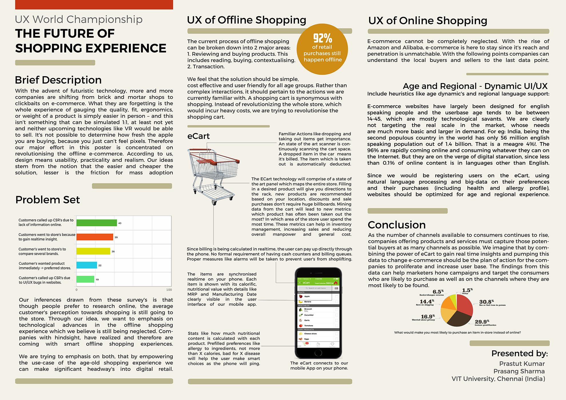
The competition challenged students to develop interactive concepts for future shopping experiences in order to improve the way we shop. Each entrant had to design a poster depicting their ideas.
Needfinding
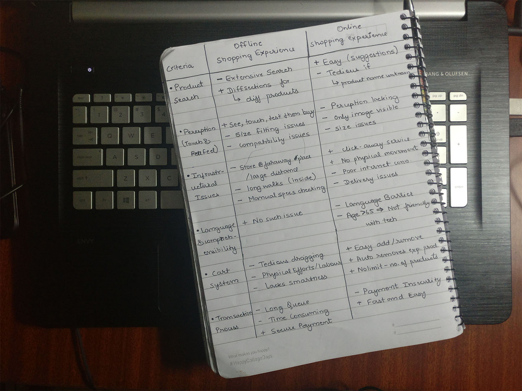
I stared with interviewing several people in and outside our campus. First I defined the target userbase and then fanned out to discover people I wanted to interact it. The goal was to identify people’s frustration points and the degree till which the UX demands extreme measures. Since the market in Chennai is still not developed for e-commerce based marketplace, the majority opinions and feedback I received was for offline commerce.
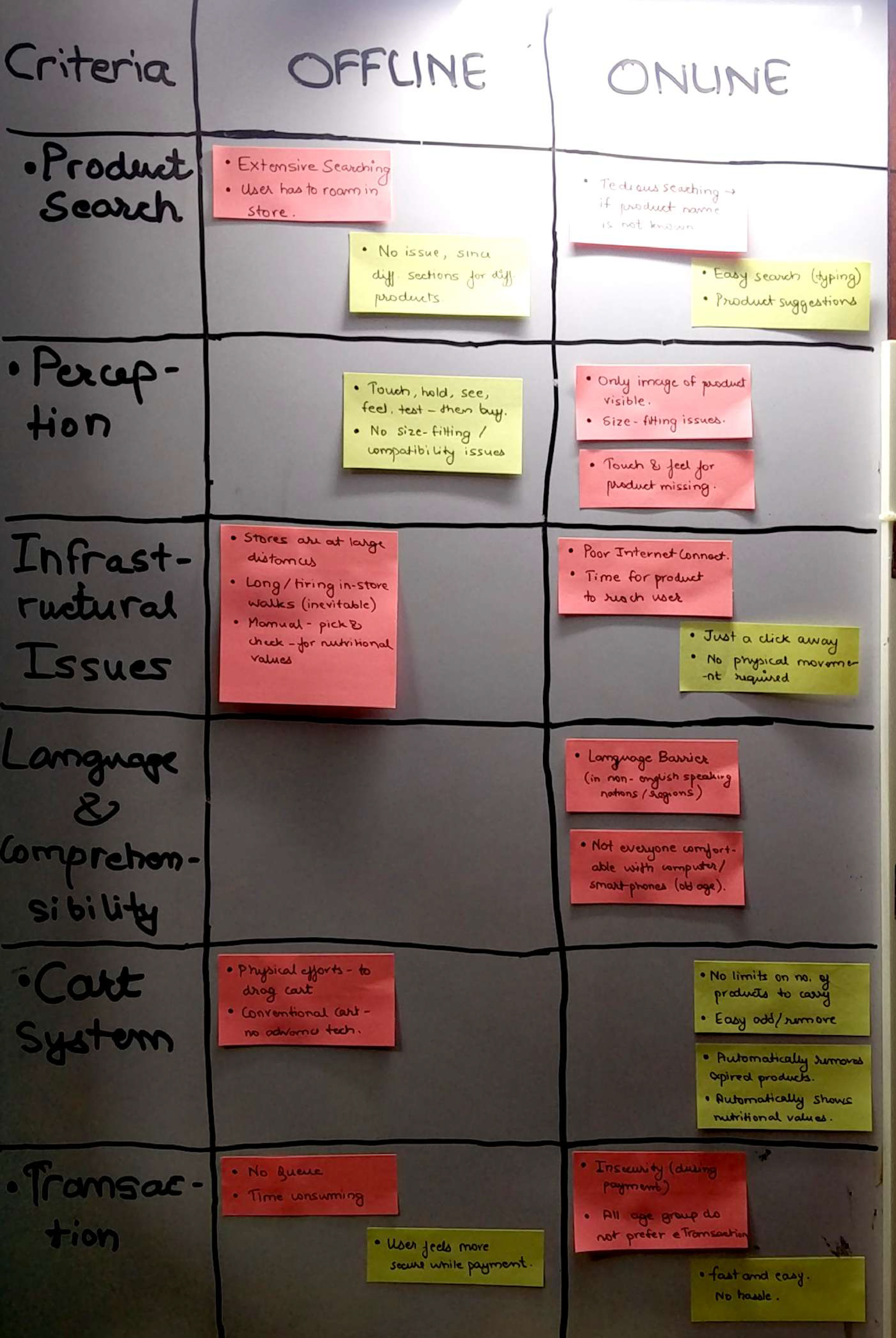
Affinity Wall
Based on the above observations, I started building an affinity wall to define two categories: online and offline commerce. I brainstormed a lot over the extent of technology that I wanted to incorporate in the final UX. I could had even suggested a VR based online commerce, but decided against it due to the various reasons listed below.
Winning Poster
Finals
The finals took place in Austria on 17th October, 2016. The World UX Congress took care of my flights and stay as well as sightseeing in Austria. At the finals, I received two additional tasks.
Task 1
It involved a questionnaire on design principles. Before coming for the finals, I read a lot about design theory which helped me in overcoming some of the tricky questions. Recommended books: Don’t make me think , Lean UX. I skimmed through Design of everyday things again so that I don’t lose sight of the big picture.
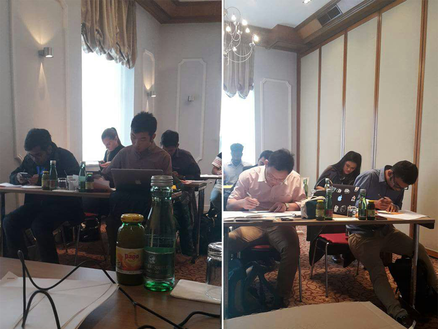
^ Participants engaged in both the tasks.
Task 2
All participants then had to design an app experience for the following problem statement:
“You are the assistant store lead for Wallmart, who are in the process of revamping their inventory management. You need to design a mobile app for electronic store pricing. The phones that are going to be deployed have NFC and Bluetooth. All assumptions have to be stated and explained.”
Each participant was given 5 minutes to pitch the idea to the jury. I first started with explaining what all tech I am going to use, followed by elaboration on the mockups. This was way before Amazon’s Go launch so I am delighted that my hypothesis, on which my proposal was built, got validated. My proposal for the same is as follows:
Technology Explanation:
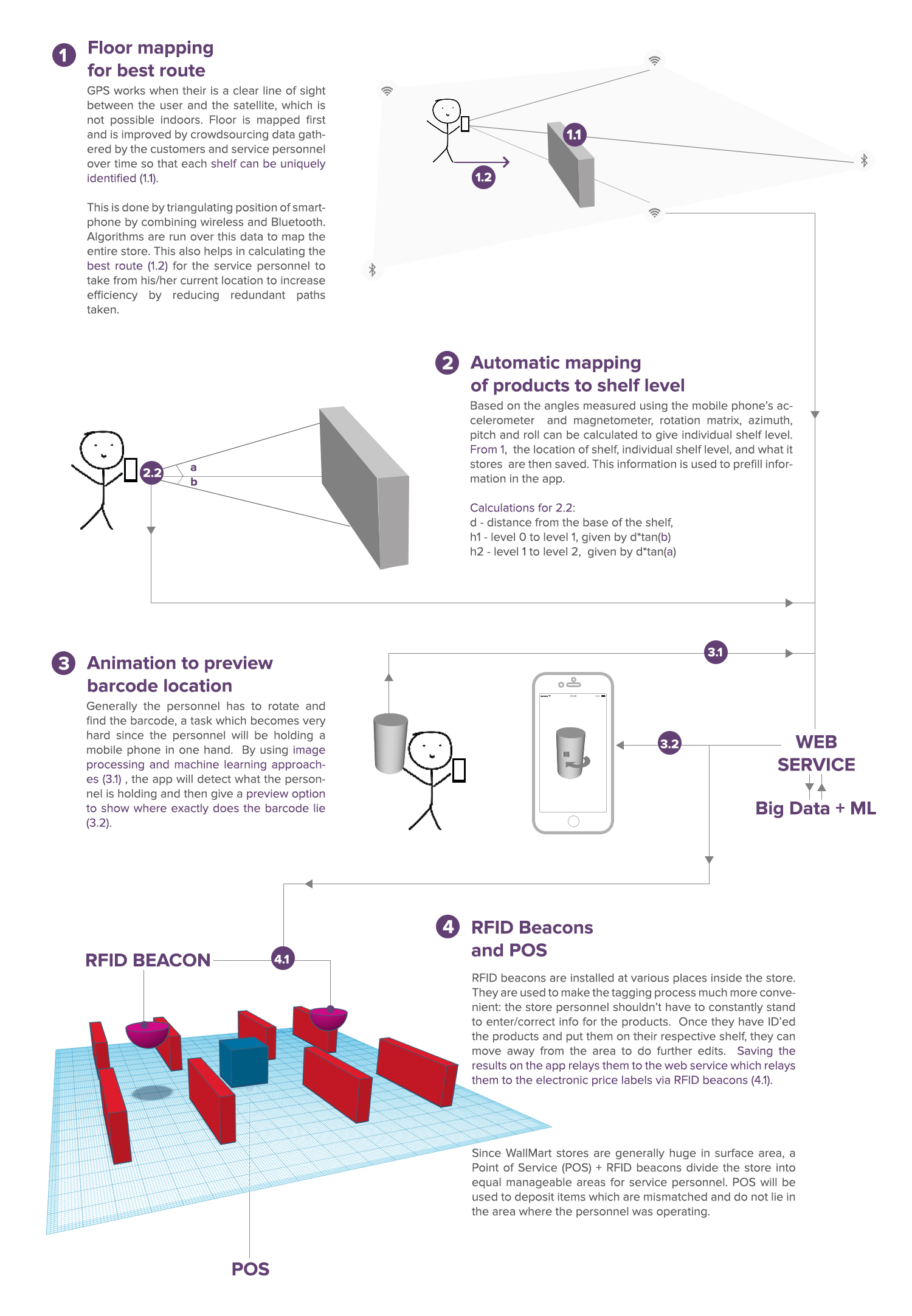
Mockup’s :
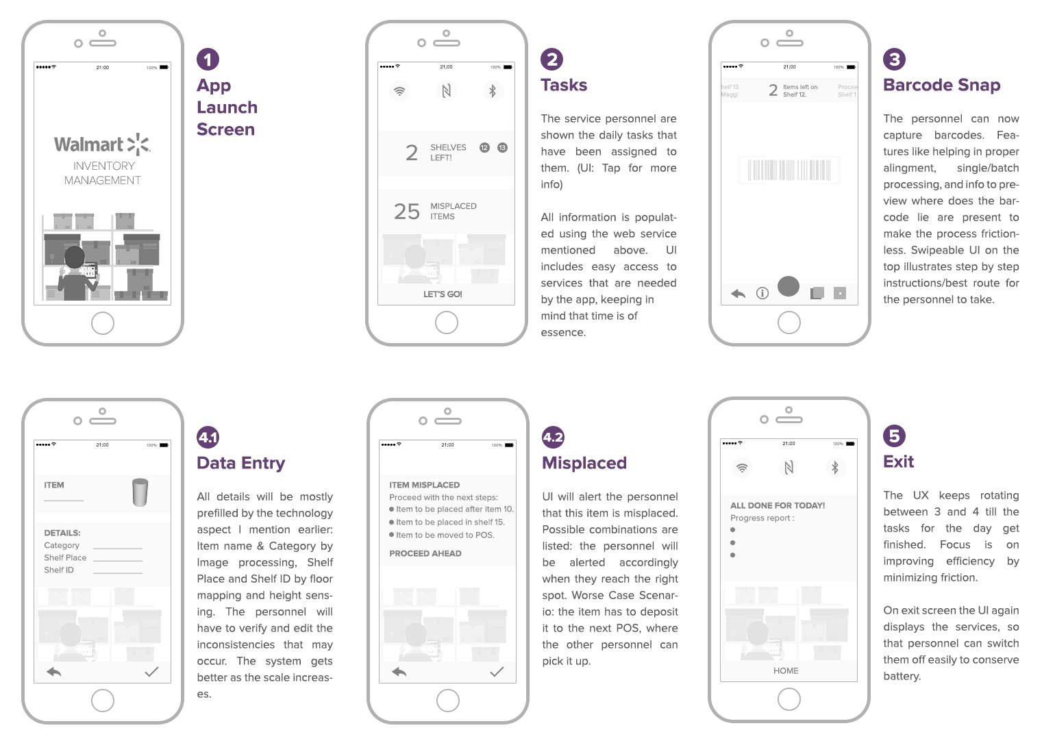
Each participant had 5 minutes to present their concept to the jury. I had to rush throughout the presentation, as I had a lot of explaining to do.
If I could do it over?
- Time management: The 3 hours design sprint was new to me and I should have balanced the time well. Corner cases were not given enough thought. The 5 minute pitch gave me insights that if the idea (presented in it’s most abstracted form) takes more than 5 minutes to explain, you are doing something wrong.
- Pragmatic vs Out of box thinking: I am fortunately or unfortunately a practical person, which sometimes hampers my creative thinking. Some of the submissions by other participants had a very creative and out of the box approach, though they couldn’t explain how they were going to do it in practice. A balance should be ideal.
- Use different personas in different context: My entire app was dependent on the hypothesis that WallMart’s personnel should have minimum friction while using the app. Therefore my app uses a lot of technology to automate even the rudimentary parts. Flaws seem to emerge eg. if the personnel knew the store blueprint inside out, do we require floor mapping? Meeting the people for whom you are going to design is always imperative.
Conclusion
The jury, which was composed of experts from sponsoring partners and WUC speakers, chose the winner of the UX World Championship. Sadly, I couldn’t win the competition but the tremendous exposure and learnings that I got meant so much more than that. I had an amazing time meeting and deriving insights from the jury as well as people who attended WUC. I thank Mr. Hannes Robier, Chair and Organizer of WUC, for giving me an opportunity of a lifetime.
