
Bubble Social
Data Visualization Research Intern
- project duration: June 2017 - Present
After having experience building and collaborating with people on large scale consumer facing products like Teem, Cambuzz, Houseafic & BetterButter, I was always intrigued by the amount of data consumers produce and the thinning borders between data science and design. Junior year summer vacations were round the corner and I wanted to dive deep into the field of data visualization. Professor Venkatesh Rajamanickam heads the Info Design Lab as well as the Interaction Design Program at Industrial Design Center (IDC), IIT Bombay. He is amongst the leading experts in the field of data visualization in India. I was fortunate to work under him past summer and this post describes the work that I got to do with him.
One of his projects involved mentoring an IITB alumni run student startup called Bubble. According to my skillsets, he asked me to collaborate with them. That way I could learn the nuances of data viz in a fast moving/agile way.
About Bubble Social
A large volume of data is generated by people on Social Media platforms each day. This data is made up of comments and opinions about what’s happening around the world. Be it a political event or a natural disaster, a sports event happening halfway across the globe or a new product release. Owing to its massive volume, the data is not consumable for people who want to use social media to follow one or more of the above mentioned topics.
Social Media platforms have tackled this problem by establishing content recommendation engines which provide people most relevant comments and opinions. This leaves the important aspect of overall crowd opinion out of the scope of the platforms. Its impact can be seen in the form of current social media consumption trends where users get stuck in niches based on their usage trends. This is the single biggest challenge to the evolution of Social Media as Participatory Media Platforms.
Bubble integrates social interactions with content consumption experience to provide you a single stream for all your news/debates/discussions alike. The proposed framework distilles large volumes of social media data about any given topic to mine crowd opinion and present it in a consumable format for the people.
Primary Research
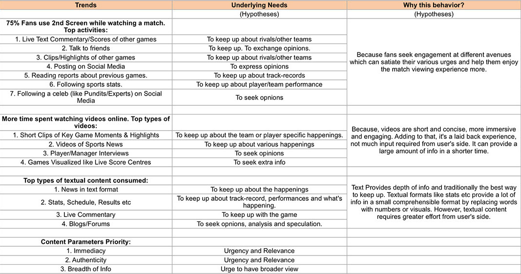
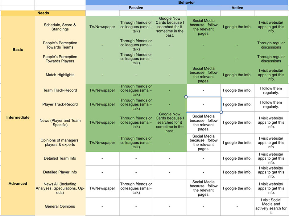
We initially focused on a soft niche that the team personally cared about: sports. Looking from data perspective, we had monumental amount of data being produced during sport events on social networks in terms of discussions, analysis, banters etc. We started with observing the global trends on how sports fans engage in a match-watching activity and analyzed their needs and the cause of their behaviour. The same is tabulated below.
Understanding the User
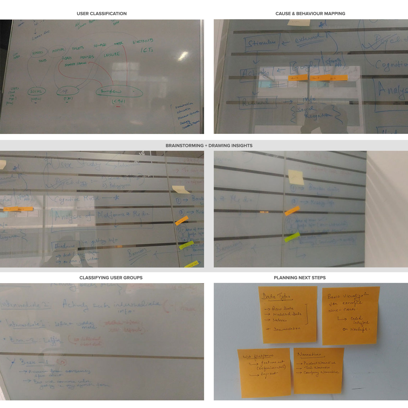
We conducted several contextual inquiries inside and outside the IIT Bombay campus to understand the user domain. It took us a week to create affinity maps and come up with insights about our user. We tried to analyse user needs, their behaviour & their response and affinity towards sport news and then categorised them into different user groups.
Result of Research
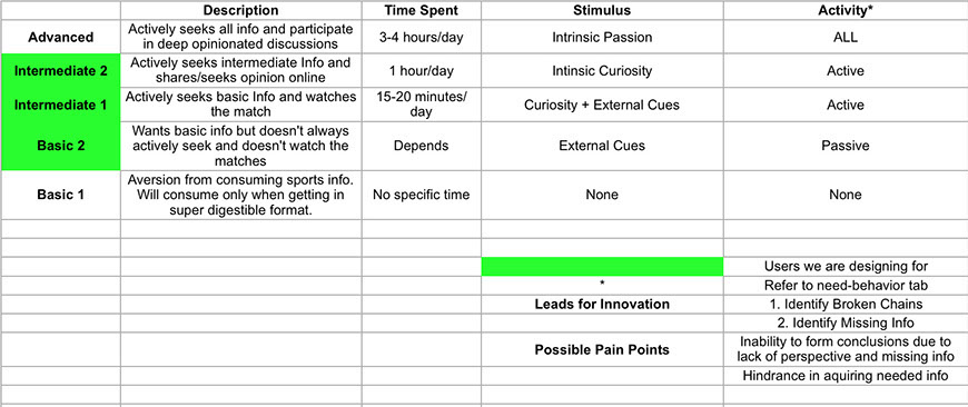
We classified the users into 5 groups:
- Basic 1 : Do not care about the sport news, does not proactively spend time to research the sport news, but will consume news only when it is spoon-fed to them in a digestible format.
- Basic 2 : Want basic sport news, but are not ready to devote their time to watch the matches.
- Intermediate 1 : Actively seek basic sport info and watch the matches.
- Intermediate 2 : Actively seek intermediate sport info and share/seek opinions of other sport fans.
- Advanced : Actively seek all the info and participate in deep opinionated sport discussions.
Out of the above categories, we decided that we would not be able to help the Basic 1 category because they simply do not care enough about sports. Also we would not be able to help the Advanced category because they already know it all and will continue to do so even without any help.
So we decided that our target users would be the three categories of Basic 2, Intermediate 1, and Intermediate 2.
We decided our target users as Basic 2, Intermediate 1 and Intermediate 2. It was very difficult to give information to Basic 1 as they do not want to take any effort. At the same time, advanced users are experts and know everything already.
Cause & Behaviour Matrix
Framework
We extract Social Media posts relevant to a topic using ‘Listeners’. A ‘Listener’ is a set of keywords corresponding to a topic,updated and maintained manually. Each post is then processed using using our Sentiments Analysis engine which provides 2 things: Sentiment value and Entities mentioned in the post in realtime.
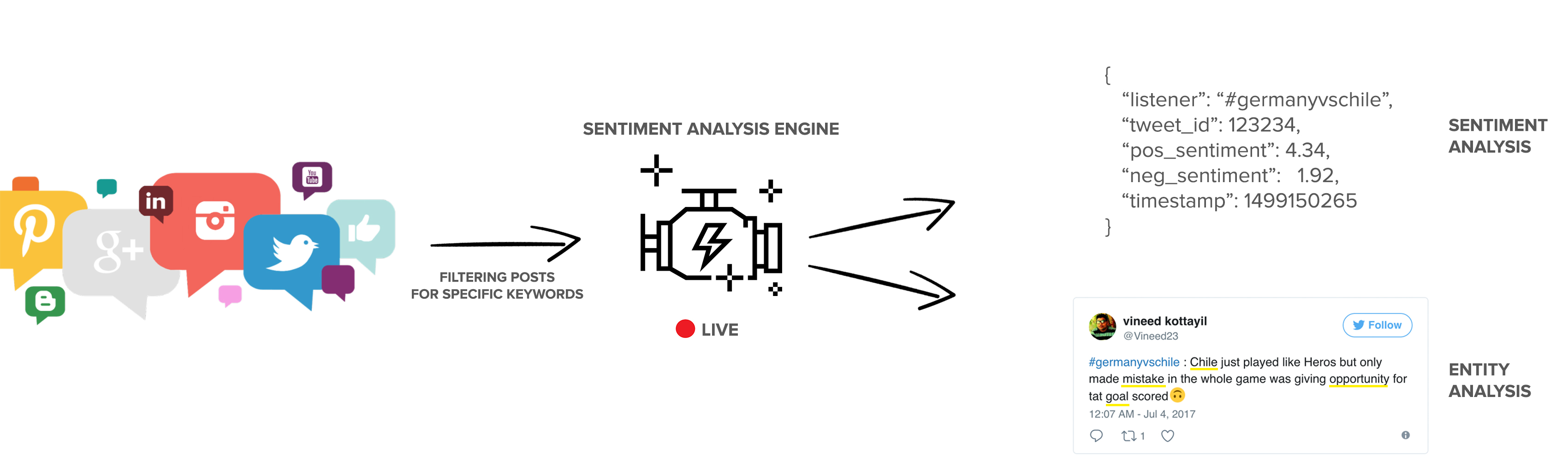
Next, we propose a framework to represent this information in a consumable format for the people.
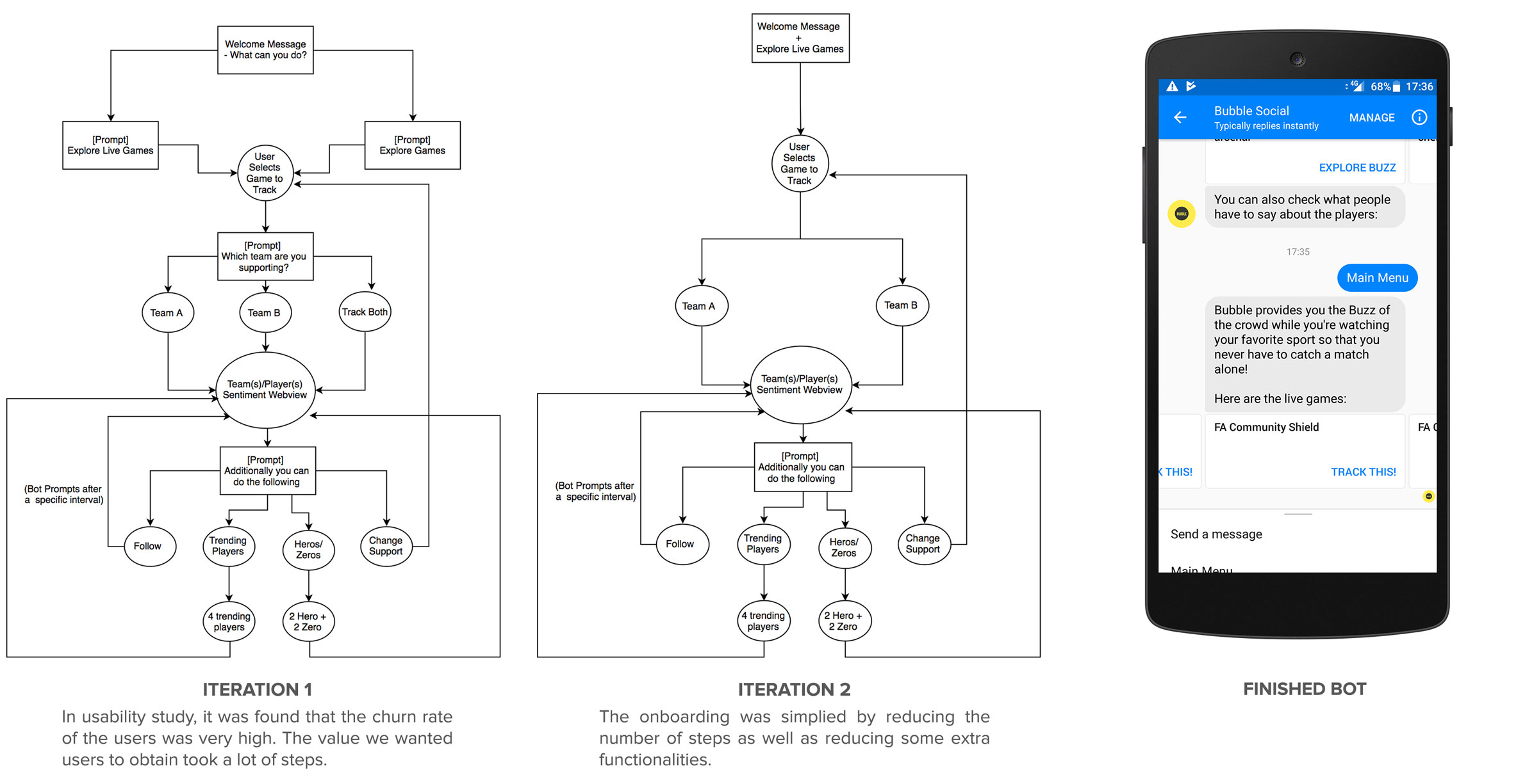
Iteration 1
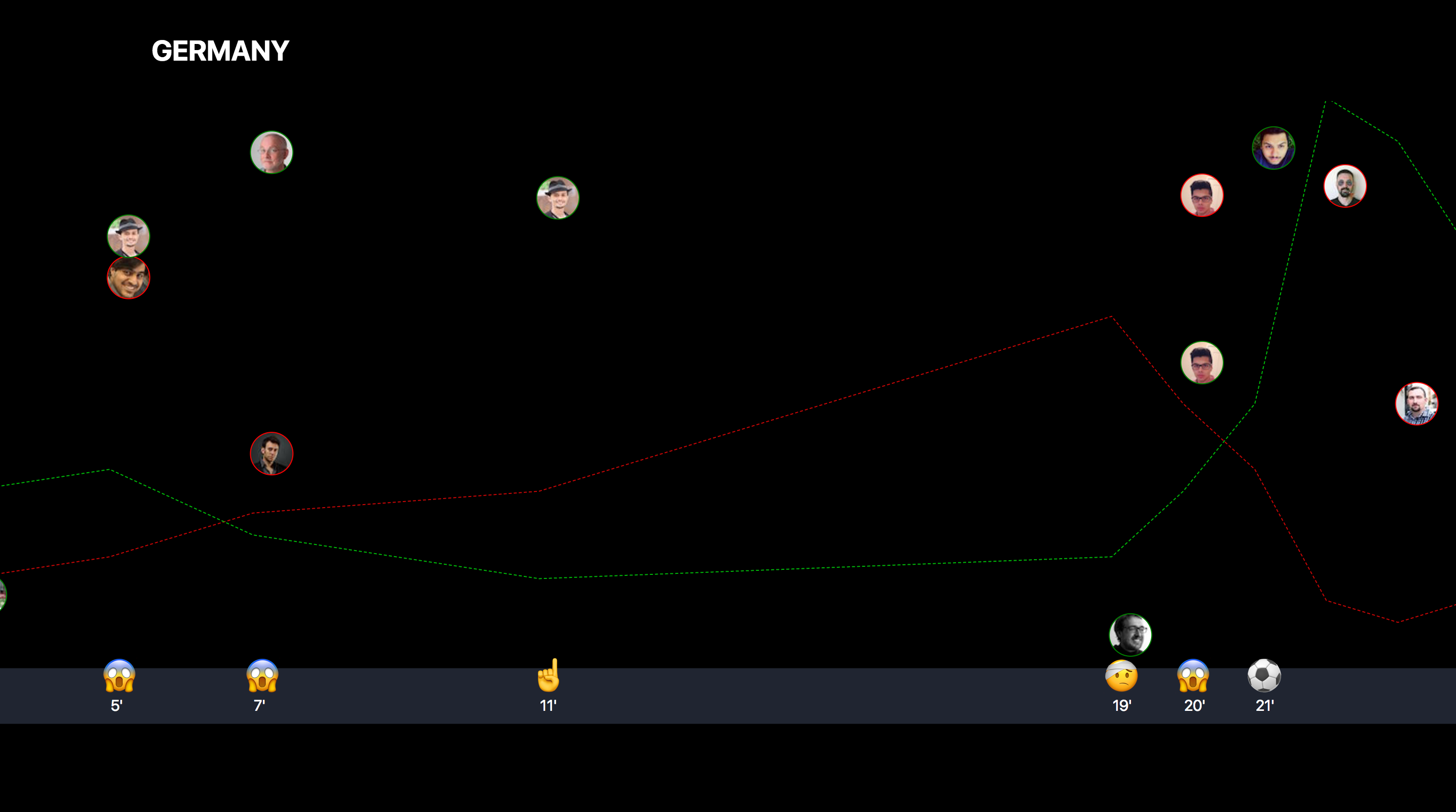
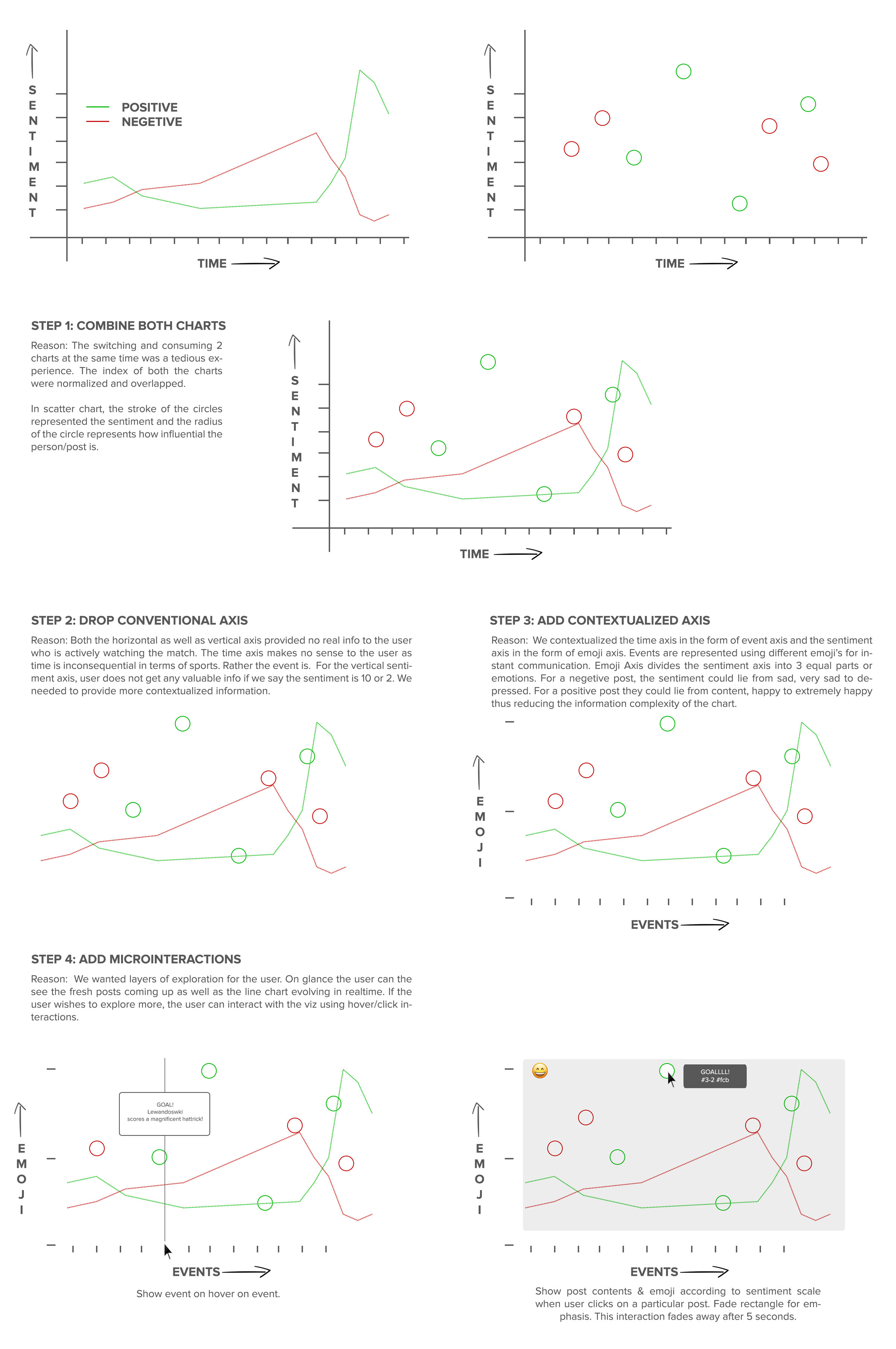
Chart1: Line charts
Using the processed data we compute an ‘Opinion Index’ which represents the overall crowd opinion towards the topic at that particular instant. ‘Opinion Index’ consists of two values: positive & negative sentiment value along with a timestamp. We opted against computing a single index to preserve the polarity of the crowd opinion at any given instant. To plot values for a particular listener, we have 2 lines: one for positive and one for negative sentiment where x value represents time and y value represents sentiment.
Line chart helps the user to get:
- Polarity of crowd opinion which is communicated by the relative position of Positive and Negative lines corresponding to any given point on the horizontal axis.
- Evolution of crowd opinion over time which is communicated by the trends formed by the line charts over time.
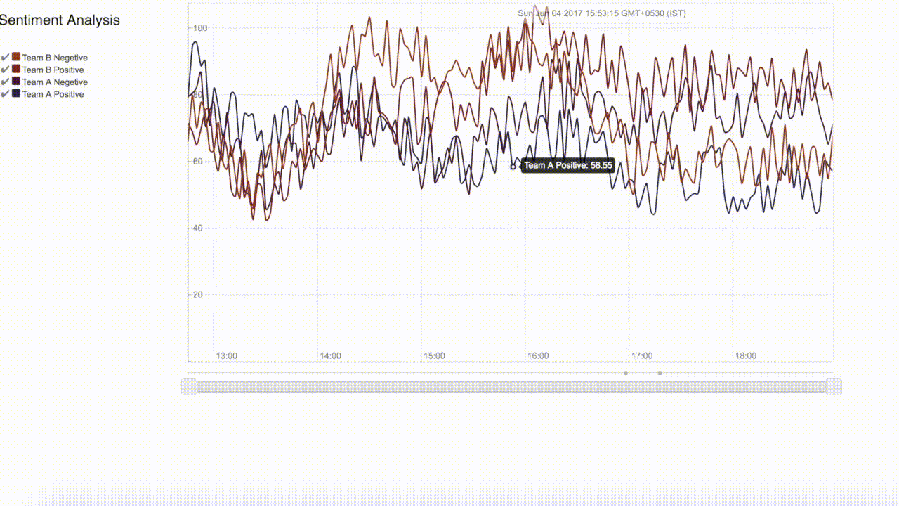
Horizontal axis - Time, Vertical axis - magnitude of the ‘Opinion Index’. First interactive Prototype.
Chart 2: Scatter Chart
Users want to see what others are talking about so we employed a scatter chart for the data we were processing. Each post is represented by a bubble. To plot values for a particular listener, x value represents time, y value represents the sentiment of the post & radius of the bubble represents how influential the user who posted the post is. When you hover/click on the bubble the person’s tweet comes up.
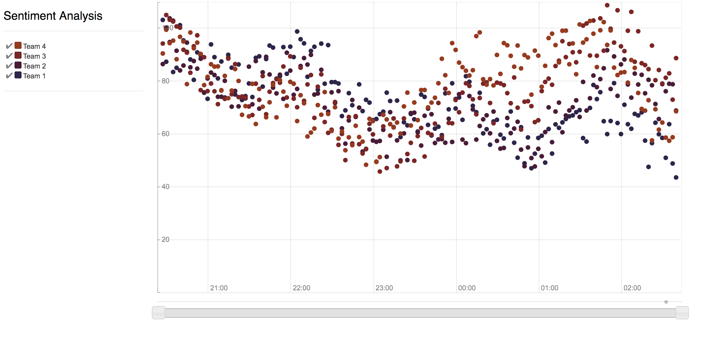
Horizontal axis - Time, Vertical axis - magnitude of the sentiment of the post.
Problems with iteration 1
Problem 1: Too much information
It was observed that people were unable to get the context of the crowd opinion while consuming the visualisation. Time in sports is more observed through events eg: we care little about when a goal was scored. To counter this, factual description of the events were added by adding another horizontal axis with an events timeline. (In the above gif, the events timeline is the circles that you see just below the x axis). The crowd opinion plotted over an events timeline gives a context for consuming crowd reactions.
Problem 2: Using 2 charts was an overkill.
Already the visualisation was informationally loaded, having people to consume 2 charts was an overkill. We decided to merge both these charts together.
Iteration 2
Iteration 3: Final Prototype
The finished viz framework. Try interacting with the above viz using zoom/pan!
Products
The proposed framework provides information about the overall crowd reaction about a given topic. Using event timeline, a temporal aspect is added which aids the overall understanding by adding a chronological sense to the series of events. Popular posts about the topic are also integrated into the framework. The visualization framework acts as a blackbox for future products. People can use this framework embedded inside consumer facing products as a participatory media platform for following an event or a news.
I led the execution of these 2 products for the team:
Messenger Bot
The bot is also live. Have fun exploring!
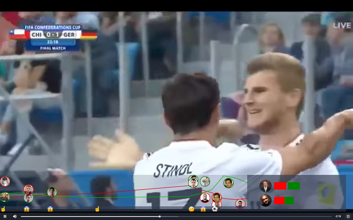
Integrating with existing video players
Conclusion
I had an amazing time working under the Professor Venkatesh. I got to attend his insightful lectures & jury sessions giving a taste of how the Industrial Design Center functions at IITB. The best quality about his mentorship is that he gave me freedom to pick and choose the work I wanted to do and he was extremely patient with the results.
In the end, my take backs from this entire experience was that the process of visualization can help us see the world in a new way, revealing unexpected patterns and trends in the otherwise hidden information around us. I am an avid reader and I realized that at its best, data visualization is expert storytelling.